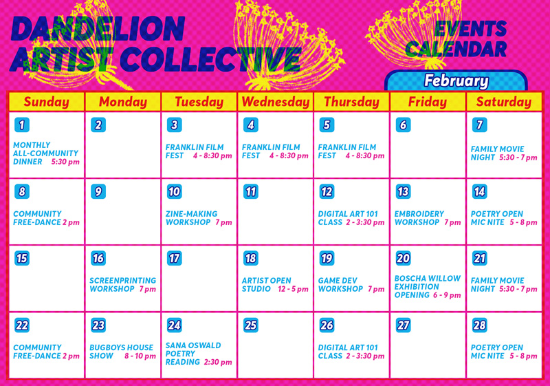
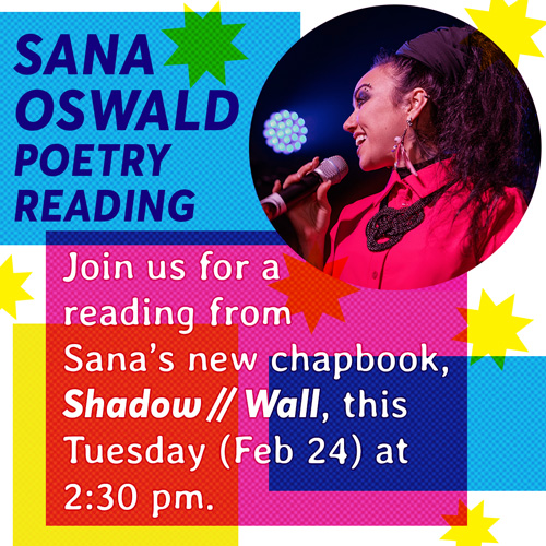
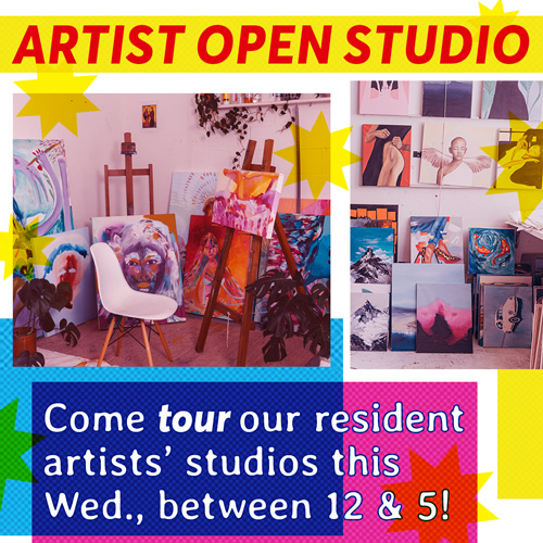
Much of my most recent paid design work is under NDA, and I cannot share it here. To flex my creative muscles and show some more up-to-date demonstrations of my skills, I have made creatives for several hypothetical brands or organizations. This is one: the Dandelion Artist Collective! In this exercise, I created branding, sample Instagram content, a calendar, several event flyers, and a tote bag product mock-up. I also wrote all copy used in these creatives.
The process:
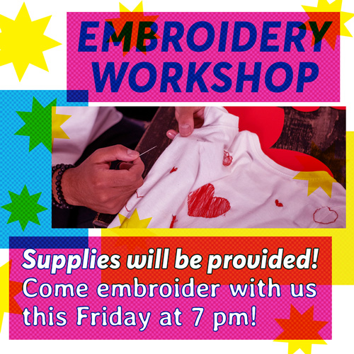
Much of the visual inspiration for the Dandelion Artist Collective's look came from printing processes like risograph. I primarily turned to base CMYK colors, incorporated halftone dots into the designs, and let visual elements overlap much the way risoprinted designs might. I incorporated fun, playful graphics like bright yellow stars both for decoration and to highlight important information, and overlaid stars and blocks of CMYK color to imitate tape, stickers, or collaged paper that might be layered in zines and other similar DIY media.
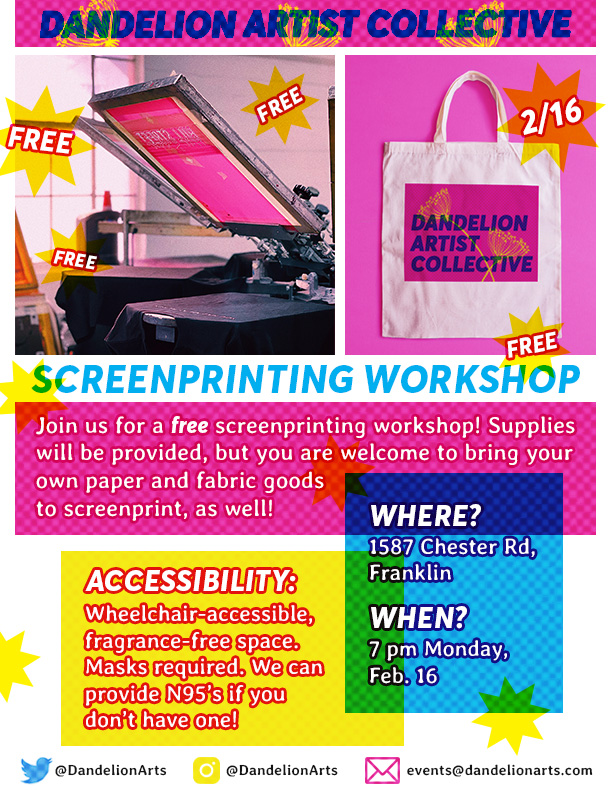
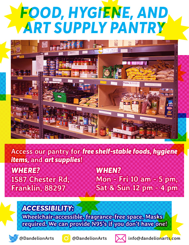
Working with a thematically-limited bright color palette, I certainly didn't need to worry about the creatives being eye-catching, but I did need to avoid them causing eye strain or being too loud to understand. The flyers especially needed to communicate a lot of information clearly, without the copy getting lost in all the bright colors. In making the Instagram posts, shown below, I had even less space to work with and needed to make sure everything would be readable and immediately clear to someone scrolling past on their phone. Bold text, sometimes highlighted with a colorful stroke, and carefully placed blocks of color helped me create legible, unique designs.
Making the logo:
Like much of the branding, the logo makes use of CMYK colors, overlapping elements with some degree of transparency, and halftone dots to evoke the kinds of pieces achieved with certain printing methods common in DIY spaces. The bold font is readable at a smaller scale, and the bright colors are eye-catching but still legible.
The stock photos used for these creatives are royalty-free, but I would like to credit the talented photographers who took the photos. The photos used for this project were taken by the following people: Ron Lach, Aaron Doucett, Antoni Shkraba, Taryn Elliott, Brando Makes Branding, Naomi August, and Alena Darmel.